Overview
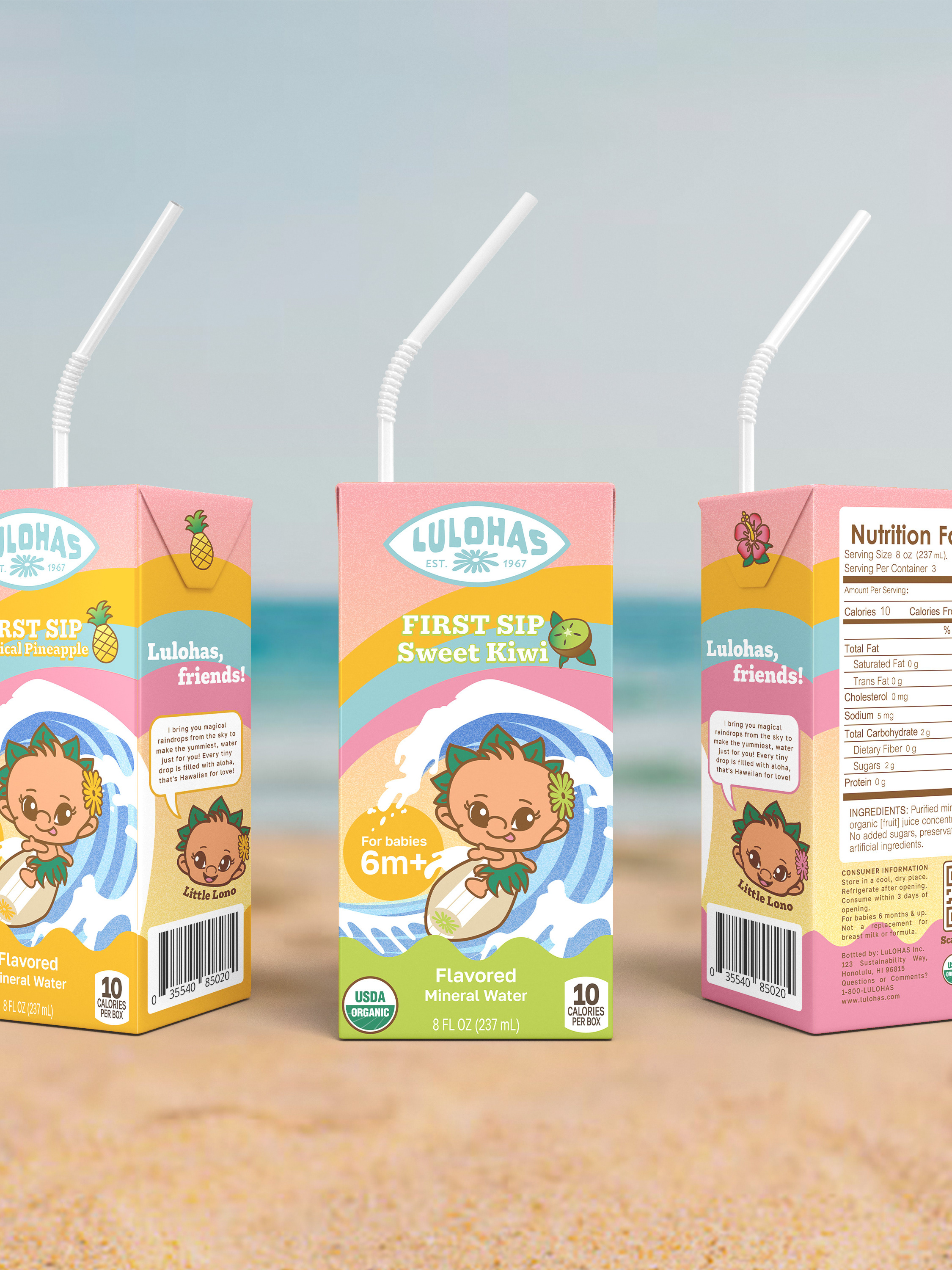
The “First Sip” product series was created as a branding and product design project for LULOHAS, a conceptual beverage brand that merges the values of LOHAS (Lifestyles of Health and Sustainability) with Hawaiian culture. The campaign introduced “First Sip,” a new series of flavored mineral waters designed specifically for young children (ages 6 months and up). The aim was to develop a compelling brand identity, product line, and packaging system that communicates safety, purity, and gentle hydration while appealing to both children and parents.


ABOUT THE BRAND
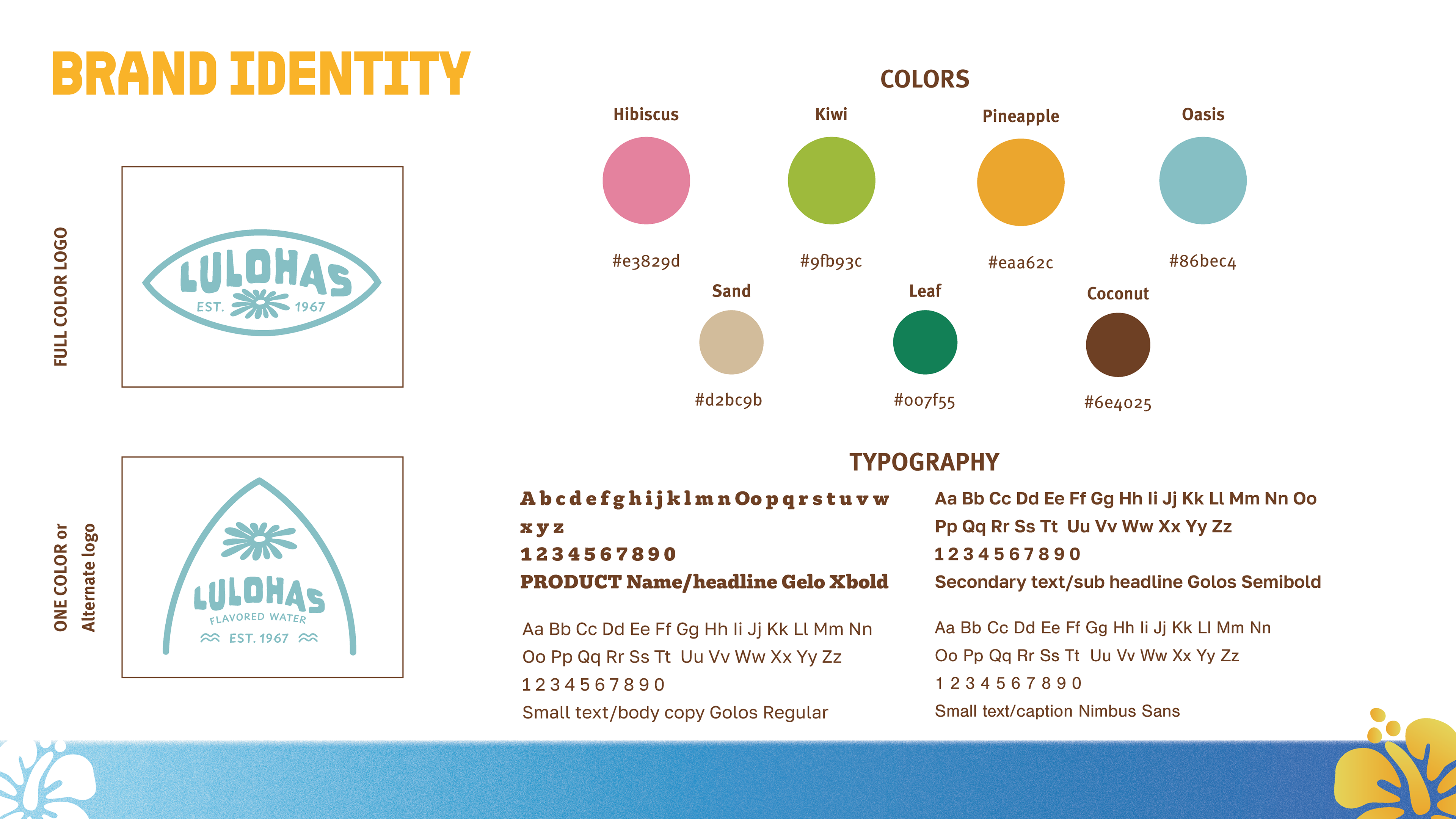
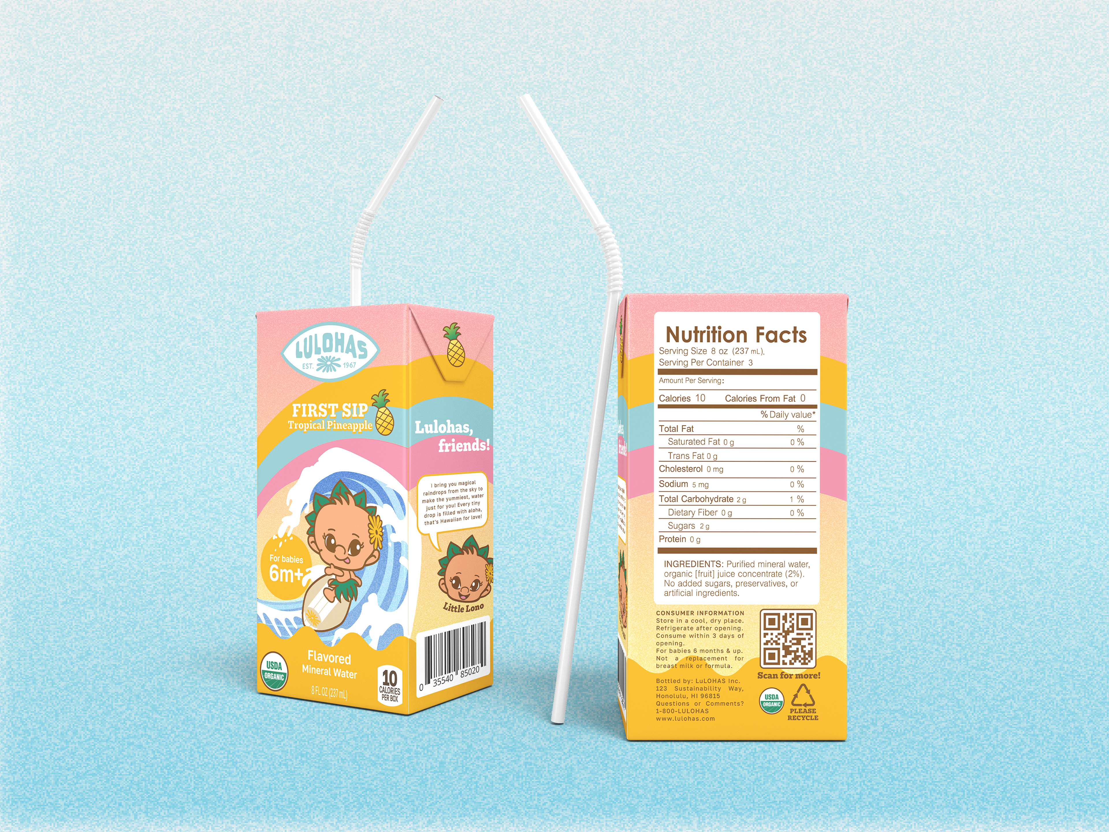
The brand name LULOHAS reflects a blend of “LOHAS” and Hawaiian influences, notably Lono, the Hawaiian deity of rain and fertility. The sub-brand and series name First Sip was carefully selected to position the product as a child’s safe and gentle introduction to hydration and natural flavors.
Target Market
Designed for young children and new parents, the branding emphasizes trust, transparency, and developmentally safe choices. This includes promoting natural, sugar-free fruit flavors with no additives, inspired by both health-conscious and cultural values.
Product Line & Flavors
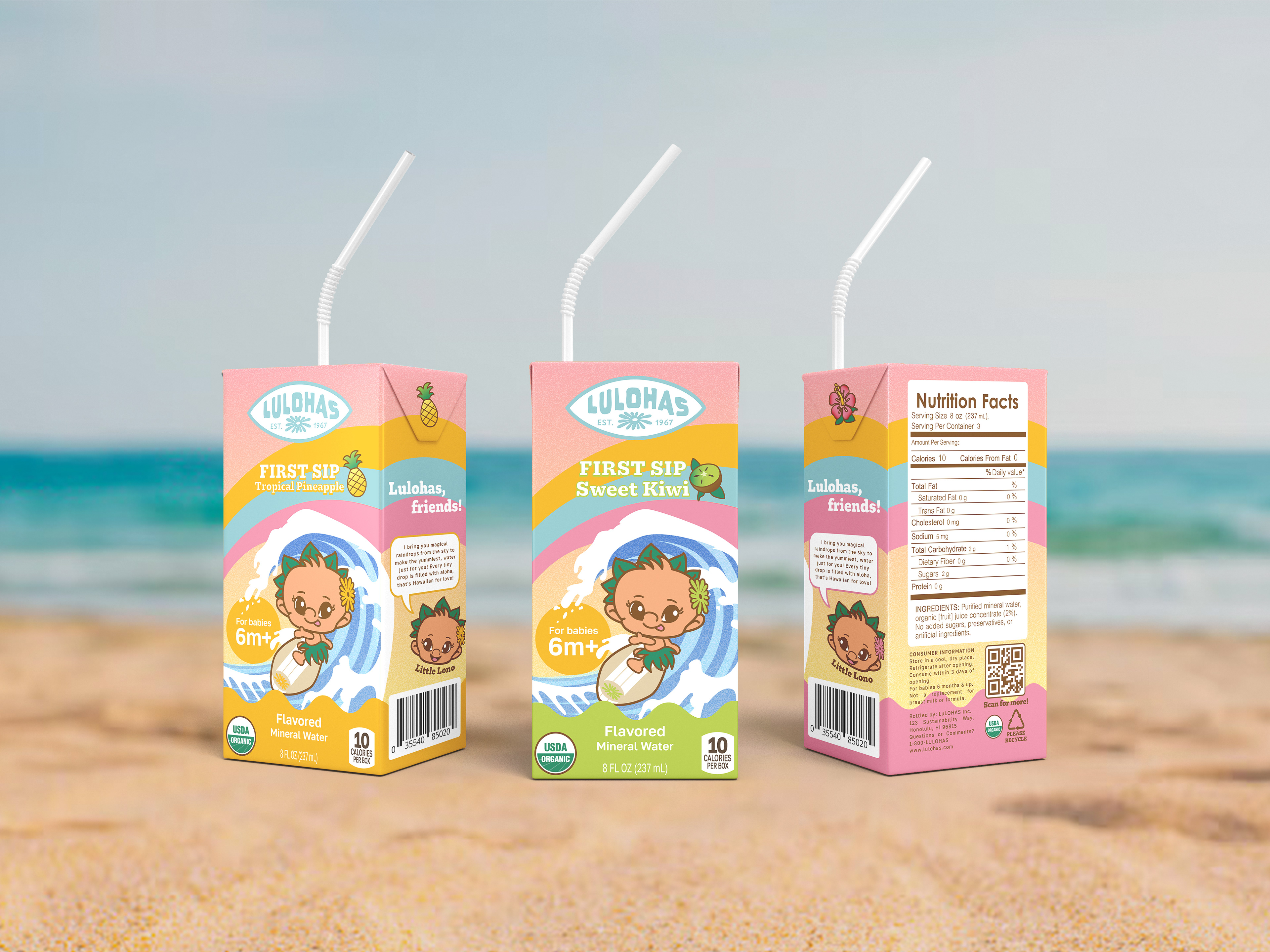
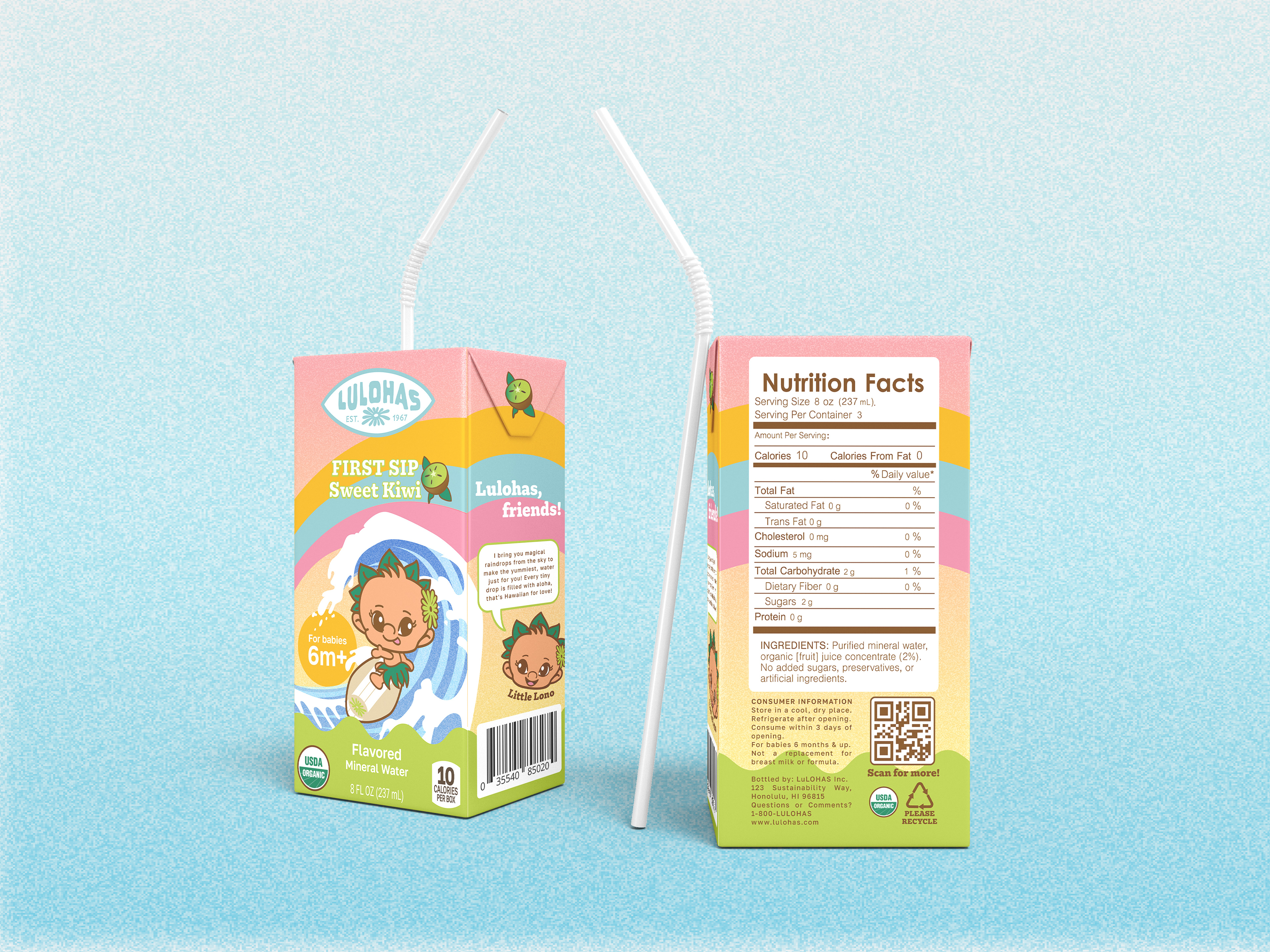
Sweet Kiwi – Gentle kiwi-infused mineral water
Tropical Pineapple – Subtle pineapple-infused mineral water
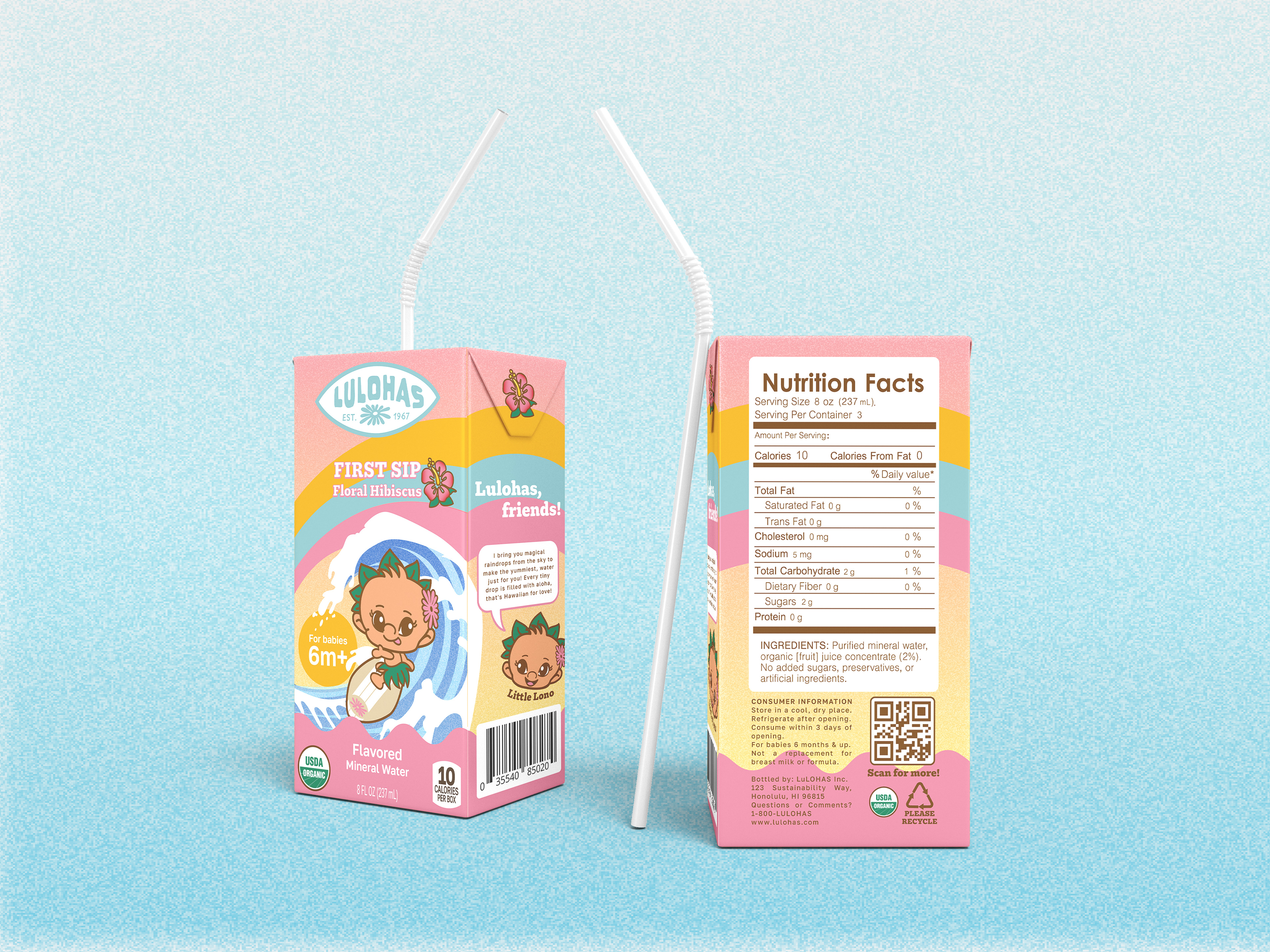
Floral Hibiscus – Mild hibiscus-infused mineral water
SOLUTION
Brand Mascot: Little Lono
To enhance emotional engagement and communicate brand values to children, Little Lono was developed as a cheerful, child-friendly mascot. Representing the deity Lono, he embodies rainfall, agriculture, and caretaking of the land. Little Lono functions as both an educator and entertainer — used across packaging, marketing, and potential animated content to explain the water cycle and sustainability to kids.

Packaging
The visual language was developed around themes of softness, purity, and nature. Color palettes were inspired by natural elements. Typography combined a bold display typeface (Gelo Xbold) for names and headers with soft, legible body fonts (Golos Regular/Semibold and Nimbus Sans) for readability and trustworthiness. The packaging structure included an eco-conscious option of mini paper cartons supporting the brand’s LOHAS commitment.
EVALUATION
This campaign successfully addressed several critical factors in child-focused branding. Recognizing strong conceptual development, coherent visual strategy, and well-executed mockups. The feedback noted the success of the mascot integration, strong alignment with the LOHAS philosophy, and thoughtful attention to both parental and child-centric branding needs.
Role: brand concept development, visual identity design, naming systems, mascot development, and product packaging mockups
Deliverables: Complete brand identity system Mascot creation& animation, Packaging design, Mock-ups